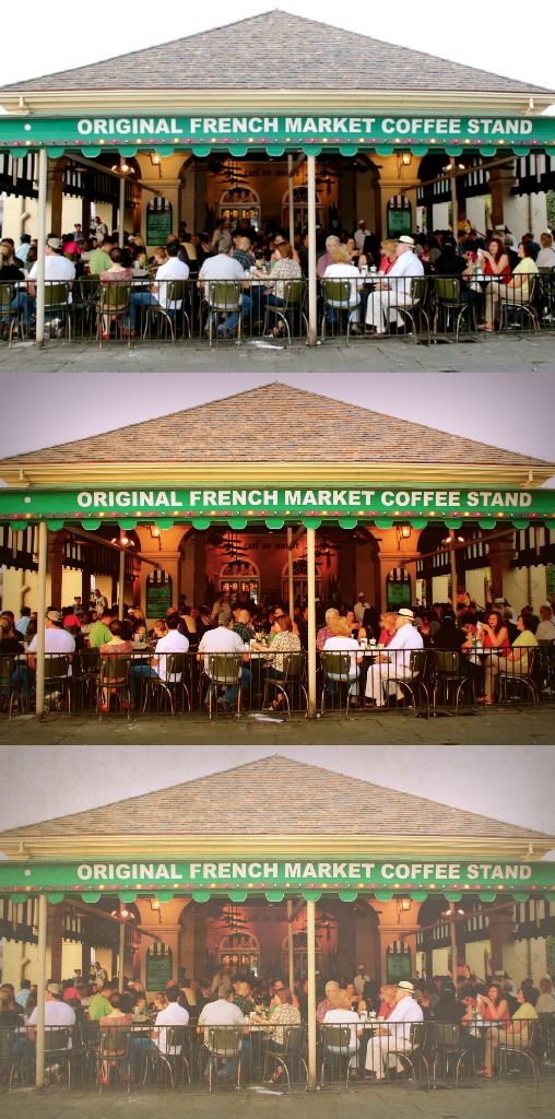
I spent a really fun Saturday in New Orleans a couple weeks back with my husband and some friends. It's such a photogenic city, and this was my first trip with my new camera! One of the shots I like from the day is this simple one of the ultra-touristy-but-still-awesome Café Du Monde. I'm showing it three ways here: the top version is straight-out-of-the-camera, the middle one is after editing, and the bottom one is after adding some texture.
What do you think? I am always a bit iffy about the texture thing, but I think I like the old-fashioned look here. Do you agree? (Is the bottom version better than the middle one?) Which one needs to be available in my shop?

